Enjoy a Google-friendly done-for-you website in days!
Only GoSite launches a complete, affordable online presence fast for local service pros.
12 Best Construction Websites to Inspire Your Contracting Business
Look through this collection of effective, user-friendly construction websites to inspire your own.

Are you looking to revamp your construction business website or create a new one from scratch? Look no further!
We've compiled a list of the 12 best construction websites from around the web that will inspire you with their design, functionality, and content. From stunning project portfolios to informative blogs, these websites are sure to give you the inspiration you need to take your contracting business to the next level. So, let's dive in and see what makes these websites stand out from the crowd!
Jump to:
- Jackson Design & Remodeling
- Joel & Co. Construction
- Westlake Development Group
- Innercity BuildMX
- Cooper Design Build
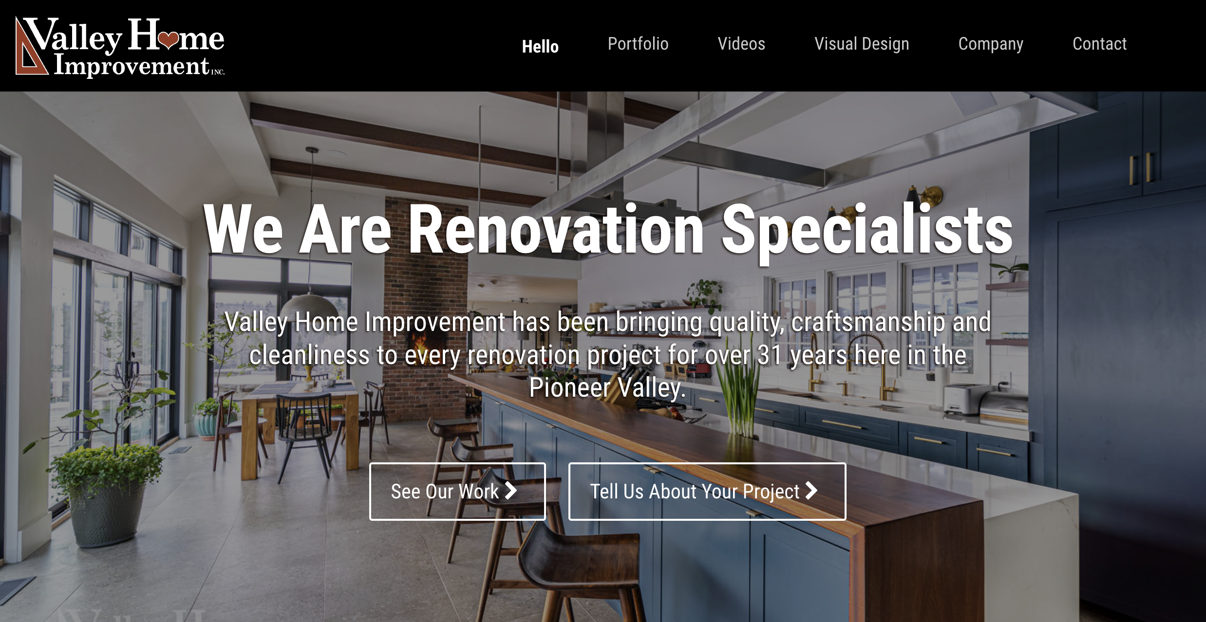
- Valley Home Improvement
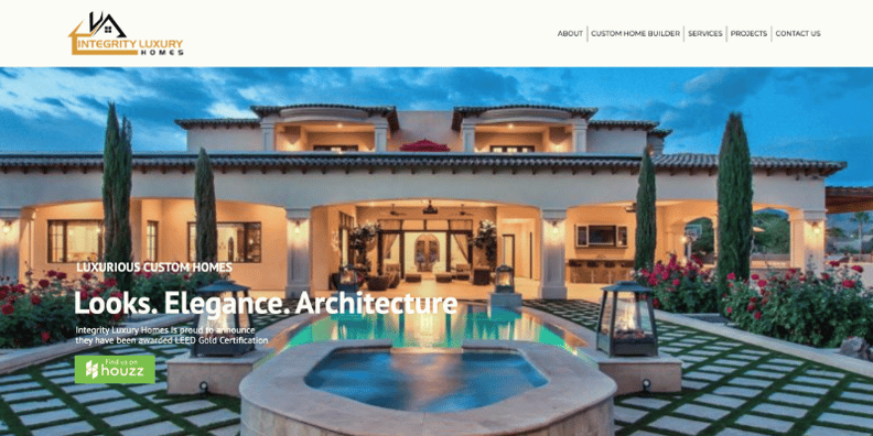
- Integrity Luxury Homes
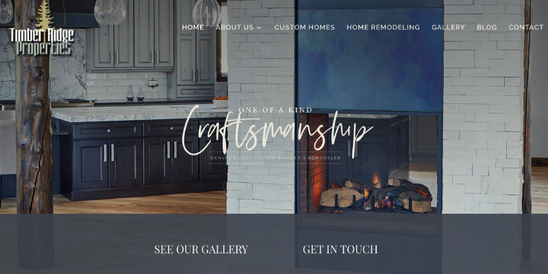
- Timber Ridge Properties
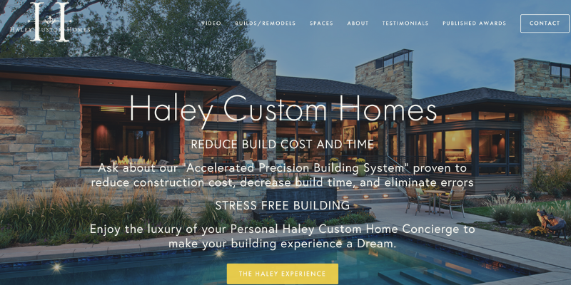
- Haley Custom Homes
- Frontier Construction & Restoration
- Castle Homes
- Becker & Sons Construction
What Makes a Construction Website Great?
Website agencies would love to give you all the bells and whistles (for a price!), insisting that each feature is critical to your success. But what are the actual parts of your website that matter?
In the examples below, you're not going to always see a website that looks super sexy or offers every digital tool in the book. But they work great for customers, and here's why:
- They are visually appealing.
- It's super easy to know where to go to find what you need (navigation).
- They showcase excellent work done.
- Most offer authentic customer testimonials.
- Services, products, and offerings are clearly stated and explained.
- NAP (name, address, phone number) are clear and consistent across the website.
- They've made it easy to take next steps.
Jackson Design & Remodeling
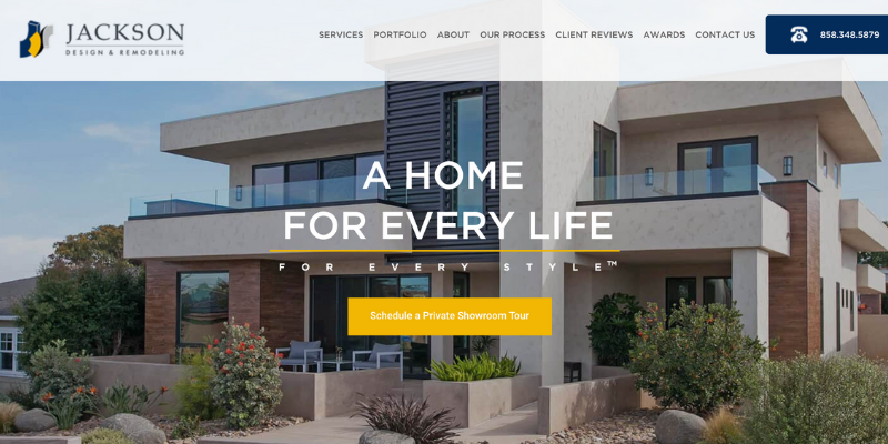
Jackson Design and Remodeling’s website is robust and includes an up-to-date blog, information about each service they provide, and a locator where their clients can find remodelers in other areas of the country offering the same level of quality work as they do.
We like this website because:
- It’s easy to navigate.
- It looks freshly updated with new content.
- Important information including phone number, reviews, and bookings is easy to find.
Joel & Co. Construction
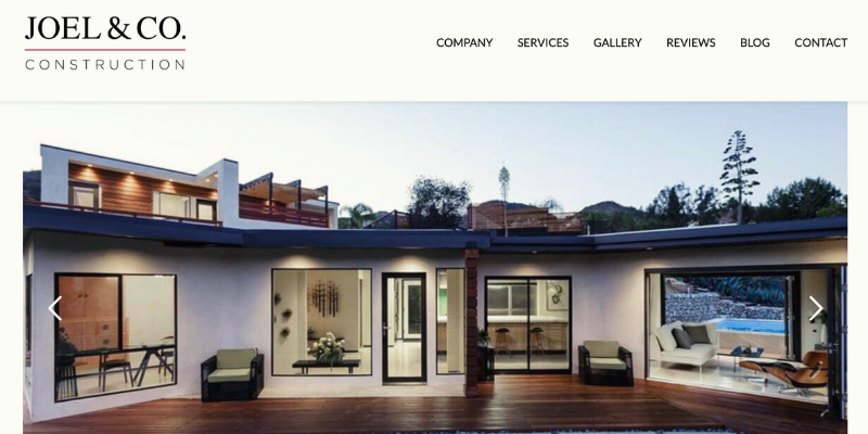
We love the clean and elegant look of Joel & Co. Construction’s website. The photo slideshow on their homepage showing beautiful photos of their past work, along with the rest of the layout, gives a great presentation right off the bat.
We like this website because:
- It gives a succinct description of each of their services.
- The layout is simple and polished.
- Their company description sounds personable and genuine.
Westlake Development Group
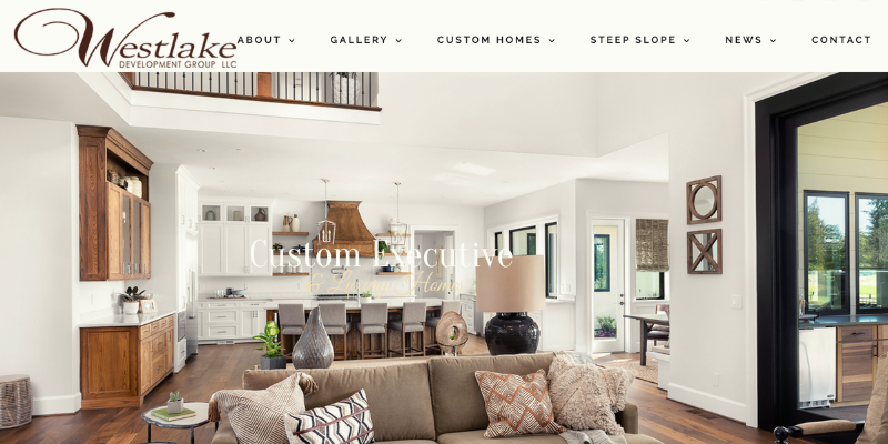
Another good site with exemplary imagery, Westlake Development Group uses multiple forms of content to create an engaging website. From professionally shot photography, video, and user-generated content from their social media, clients can easily view the full scope of their work.
We like this website because:
- The copy reflects the demand in their area by providing information on steep slope and earthquake construction.
- It integrates their social media channels to create a more personable experience.
- It provides several interactive virtual tours to show past work.
Innercity BuildMX
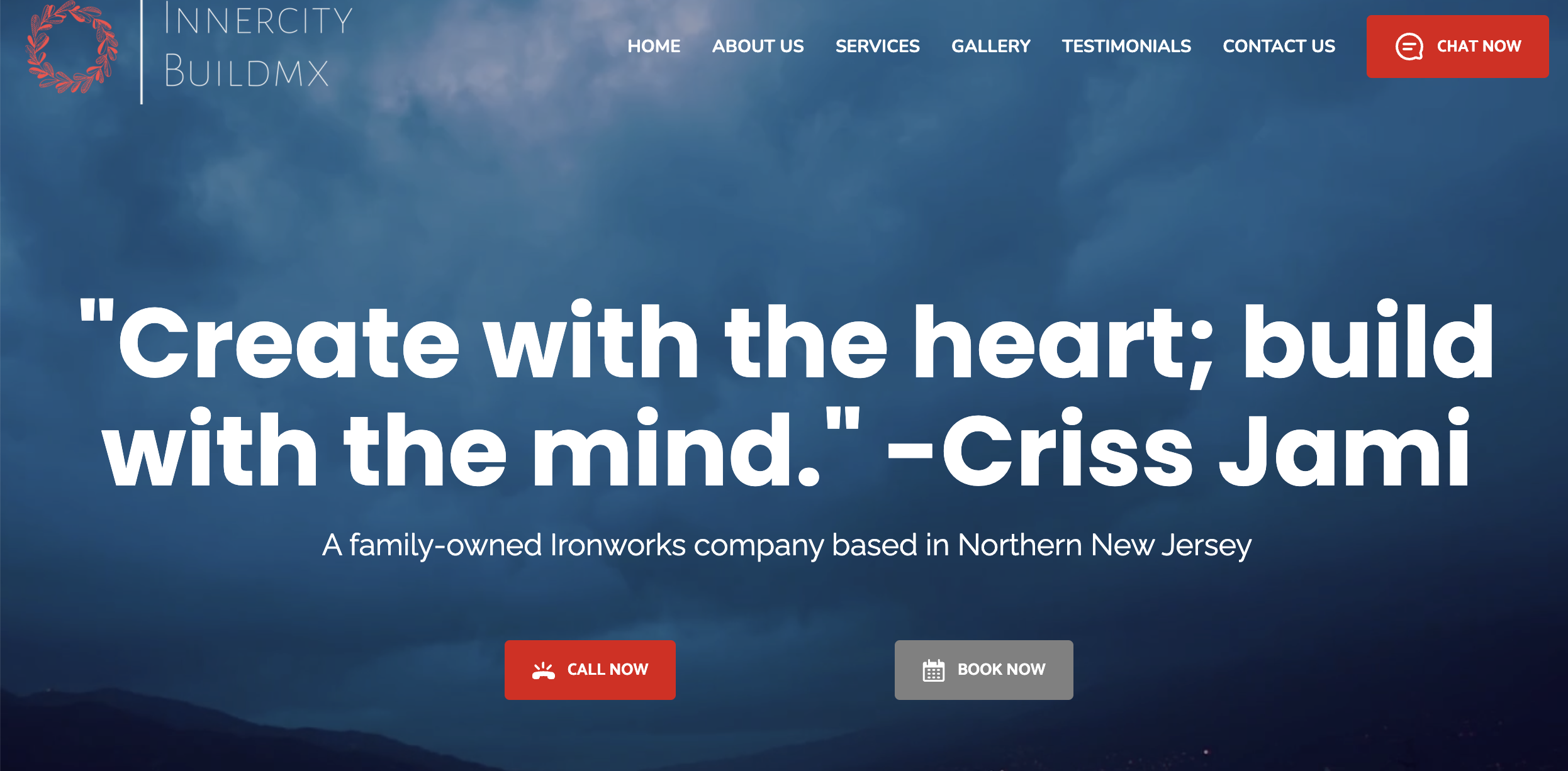
Innercity BuildMX is a GoSite customer. Learn more about construction business websites from GoSite.
Your website should help you create a great first impression, as well as make you easier to do business with. Innercity's website is great in that the look and feel is pleasant. There are also several ways to engage the company, such as calling them, booking an appointment, or starting a web chat.
We like this website because:
- It showcases an inspiring word from the founder, giving us a peak into its mission.
- It's easy to navigate and find what you need before you consider working with the company.
- There are many interactive widgets to help visitors take next steps, such as booking an appointment, making a call, or sending a message.
Cooper Design Build
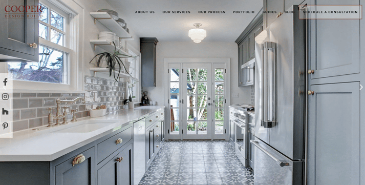
Cooper Design and Build’s website is minimalist and modern with bright images and a clean layout. We also like their content offerings and calls-to-action at the bottom of the page which helps prospective clients view more of their work and read useful information as they embark on their remodeling projects.
We like this website because:
- The images are beautifully shot and set large.
- It provides a downloadable ebook to inspire future and current clients with the latest designs.
- Past projects are presented with information about the property, customer testimonials, and a look into their process for that particular design.
Valley Home Improvement
Valley Home keeps it simple and makes a great first impression. Its site features a portfolio section, informative content on their design and build process, and demonstrates their commitment to clean site standards. This highlights their quality and professionalism.
We like this website because:
- The company added plenty of relevant content (copy) on its site, including a blog. Not only does this help its local SEO, but it is also very information to prospective clients.
- Every main page is easy to understand and navigate.
- It showcases large collections of successful projects.
Integrity Luxury Homes
If you have some great video content to share with potential, new, or current clients, check out Integrity Luxury Homes’ homepage layout. We love the flow of their site as it starts with clear call-to-action buttons to explore past projects, learn about their processes, or start a project followed by professionally shot videos to help further reassure clients of their experience.
We like this website because:
- It categorizes a few past projects by design style.
- Each page contains a call-to-action to contact the company with a new project idea.
- Accreditations and awards are clearly visible at the bottom of the home page.
Timber Ridge Properties
For another example of a simple but modern site, we love this one for Timber Ridge Properties. It looks optimized for the reader by highlighting their value propositions with a clear header hierarchy and balanced use of different font weights and styles. Their gallery page also categorizes past projects by design style to make it easy for prospective clients to check out designs based on their taste.
We like this website because:
- It has a cohesive color scheme and balanced use of fonts.
- It uses a modern but inviting theme.
- It has clear calls-to-action to contact and check out their past work on the homepage.
Haley Custom Homes
Making your website visitors feel like they’re receiving a personalized experience and the best bang for their buck by choosing your services will help boost lead conversions. Haley Custom Homes does a great job of this by adding beautiful images to their home page, setting a clear call-to-action button inviting visitors to check out, “The Haley Experience,” and placing their value propositions front and center.
We like this website because:
- It highlights their concierge- and boutique-like home-building process.
- It complements past work with customer quotes and testimonials.
- It prominently places high-resolution images and video throughout the site.
Frontier Construction & Restoration
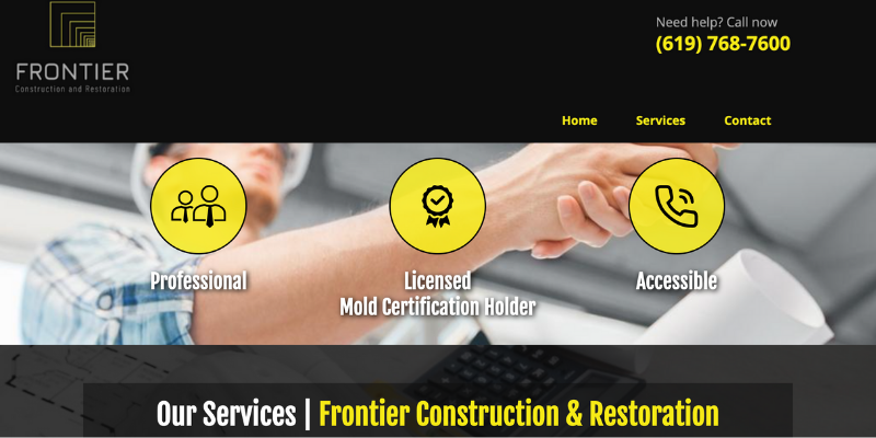
As we mentioned previously, we know small business owners often don’t have the time or budget to maintain a blog on their site, add interactive features, or write about industry news and trends. However, you can still build an efficient, on-brand website that contains all of the necessary information your clients need—and Frontier Construction & Restoration is a solid example.
We like this website because:
- It applies a balanced use of brand colors to make the layout stand out.
- The images of past work look professionally shot and crisp.
- Important information including phone number, email, hours of operation, and license number are in one place.
Castle Homes
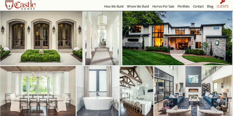
We love Castle Homes’ website because it’s robust and full of useful information but easy to navigate. The copy on their homepage is also inviting and provides information about their specialized services including green and sustainable building.
We like this website because:
- It provides fun and useful content on their blog.
- It highlights their value propositions on each page with cohesive copy and professionally shot images.
- It’s sophisticated but extremely user-friendly.
Hughes General Contractors
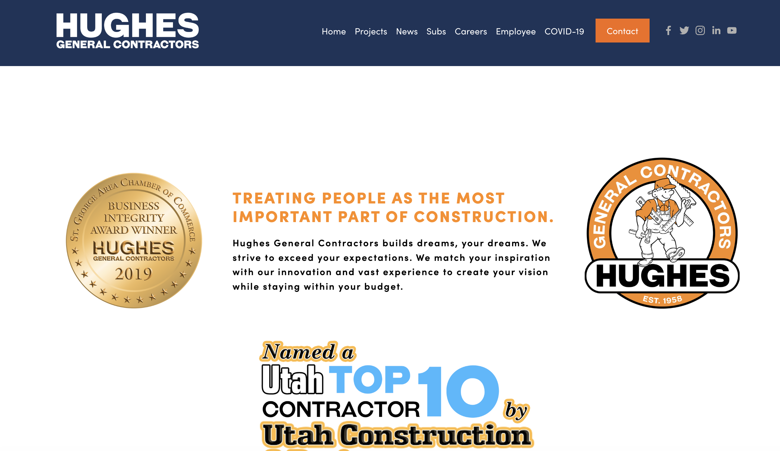
The website of Hughes General Contractors has a professional design, detailed information about their projects, services, history, and team, and is user-friendly whether you're using a desktop computer, tablet, or smartphone. The website establishes trust with potential clients, showcasing the company's expertise.
We like this website because:
- The company has won many awards which it proudly displays.
- There's a lot of quality information about the team, giving potential customers peace of mind that they will be working with quality people.
- It contains a lot of relevant industry information that clients and industry peers can use to make smart decisions.
Key Takeaways
We hope you've been able to draw some great inspiration from the examples above. They all make for great websites that you can reliably model yours after.
Firstly, they are visually appealing and use high-quality images and graphics to showcase their work. Secondly, they have clear and easy-to-use navigation, making it simple for users to find the information they need. Thirdly, they proudly display their best work and provide authentic customer testimonials to establish trust with potential clients. Fourthly, they clearly state and explain their services, products, and offerings in a way that is easy to understand. Fifthly, they ensure that their NAP (name, address, phone number) is consistent and clearly displayed across the website.
Lastly, they make it easy for users to take the next steps, whether it's requesting a quote or contacting the company directly. By incorporating these elements into your website design, you business can publish a user-friendly and effective online presence that showcases its expertise and establishes trust with potential clients.
%20(1)%20(1).png?width=340&name=Group%2012%20(2)%20(1)%20(1).png)

