How to Have an Accessible Small Business Website That Disabled Customers Love
Creating a website that is accessible to everyone is an important part of your online success. Read on and learn how you can do it.

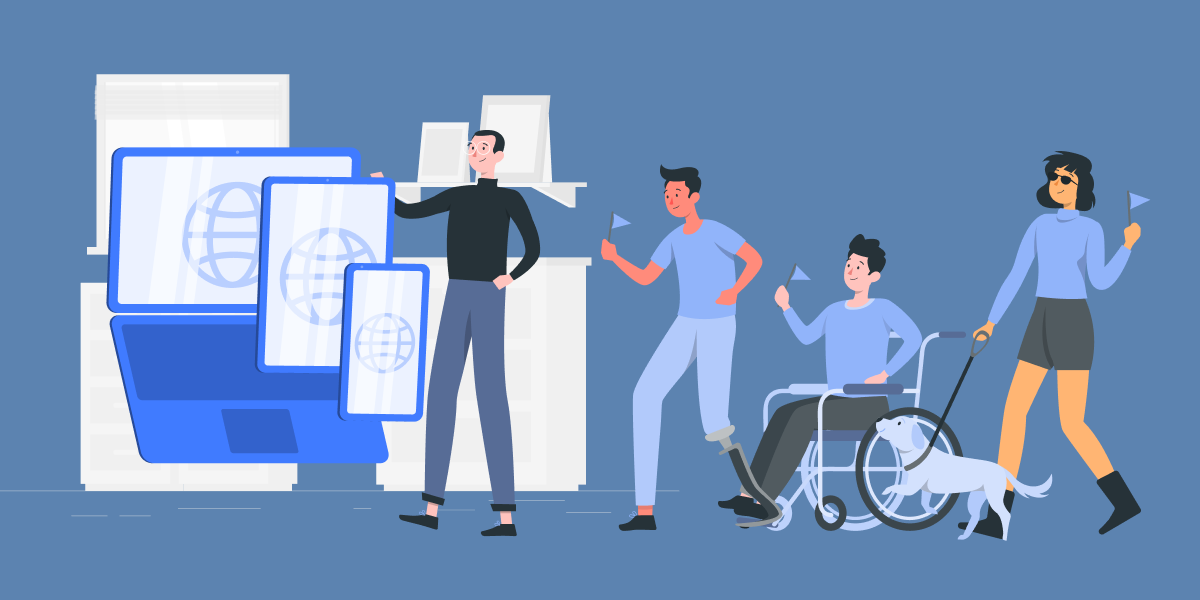
Disability accessibility is more than a long series of complicated technical rules. It is a concerted approach to make your products and services available to people with disabilities. Since that accounts for about 15% of the population, accessibility can drive value at every stage of the business lifecycle.
Small business owners with limited resources might dismiss accessibility as an expensive, optional add-on. This isn’t exactly true for three reasons:
- Not all disability accessibility initiatives are expensive. Providing an accessible user experience to your disabled customers doesn’t mean rebuilding your business from the ground up. You won’t have to throw your current website in the trash and launch a brand new one. There are accessibility improvements available for every budget and timeframe.
- Disability rights are civil rights. The Americans with Disabilities Act applies equally to small businesses, multinational corporations, and everything in between. Freelancers and independent professionals must also observe these rules.
- Disability accessibility is an asset, not a cost. Investing in accessibility helps you address the needs of people your competitors may leave behind. That makes it a powerful way to enhance customer loyalty and grow your business.
 Source: Advocator Group
As a small business owner, your approach to accessibility must take your business’s unique characteristics into account. However, there are a few broad steps that every small business website owner has to achieve to make their website accessible to users with disabilities.
Jump to:
-
Screen-reading technology
-
Keyboard navigation
-
Great web content
-
What being mobile-friendly really means
-
Start your accessibility journey now
Screen-reading technology
Screen readers are one of the major accessibility tools the disability community uses. These are technologies that read graphic display data and text to users. This allows people with visual impairments to access the Internet through a regular web browser.
What is it?
Screen readers translate visual information either into audible speech or braille. Speech output is common for mobile devices because it requires no additional hardware. Braille devices require a refreshable braille display that is best-suited to the desktop experience. Hardware braille devices enable experienced users to absorb information much faster than is possible with speech – up to 400 words per minute.
How do you use it?
The Internet compresses a great deal of information into visual cues. For people with visual disabilities to interpret icons, menus, and dialogue boxes correctly, screen readers must accurately identify those elements separately from regular content.
When properly configured, your website’s HTML code offers much of this information to screen reader users. It will tell the screen reading software when one content block ends and the next begins. It will describe images to the screen reader so that visual information is accessible to people who cannot see the image itself.
The Web Content Accessibility Guidelines (WCAG) standards include rules about website header structure and image alt tags. These are the elements of HTML code that screen readers look for when identifying website structure and describing images, respectively. Having proper HTML structure and putting alt tags on important images is an important step toward screen reader compatibility.
These can, and should be implemented when creating an SMB website. When using Gosite Sites, you can select a theme and easily modify it so that it adheres to WCAG. Once you’re done, you can use this free WCAG compliance checker to ensure your site is fully compliant and accessible to those with disabilities.
Keyboard navigation
People with visual or motor skills impairments cannot use a mouse or touchscreen display. If your website only works with a point-and-click interface, it won’t be accessible to people who can’t point or click. These people use a wide range of technologies to translate inputs into keyboard commands.
 Source: Orange
What is it?
There are many different types of keyboards for users with disabilities. Some examples include one-handed keyboards, eye-tracking keyboards, and braille display keyboards.
Virtually any kind of movement or action can be translated into keyboard commands. After losing the use of his thumbs in 2008, Stephen Hawking famously controlled his speech synthesizer with cheek twitches.
Why is keyboard navigation important?
Most users of accessibility technologies can only input keyboard commands. If any part of your website requires the use of a mouse or touch screen display, it is probably not compatible with any of these devices. This essentially excludes people with blindness, motor skill impairments, and neurological disorders from using those features.
Navigation is especially important because it is the gatekeeper between users and content. People can only consume content they can successfully navigate to. Very few people can successfully remember a complicated URL, and asking people with disabilities to do that is unfair and even impossible in most cases.
Great web content
Navigability is critical to the accessible web experience, but content is what people are actually looking for. Connecting people with valuable content is the primary reason the Internet exists at all. People with disabilities have the same expectations, and website owners should strive to meet those expectations.
How to get it
Web creators need to consider the user experience of people with disabilities when creating content. That entails avoiding some of the shortcuts and pitfalls that content creators often take:
- Avoid images of text. Imagery can help make a point or drive an emotional impact, but it shouldn’t tell the whole story. If you have to publish images that contain text, make sure the text itself is available elsewhere, either as an alt tag description or in another section.
- Check color contrast. Visual impairment doesn’t just mean blindness. Many people have trouble distinguishing between similar colors – including people with perfect eyesight. Text should stand out from its background, especially if the background is an image.
- Write meaningful anchor links. Screen reader users often organize web pages by content type to make navigation easier. They can group all the anchor links on a page together, making it easier to move from one page to another. This doesn’t work when every link says nothing more than “click here” or “more”.
- Keep content consistently organized. Consistency is a key component of disability accessibility. Giving your pages a consistent heading structure helps users with disabilities understand how to navigate your website intuitively. Otherwise they have to learn and relearn how each page works on a constant basis.
- Tag language switches. Multilingual websites must serve users with disabilities who speak other languages, too. Screen readers are capable of switching between languages, but must be notified when that change occurs. Otherwise, “Español” sounds like “A spaniel”.
A clear and well-organized structure is the first step toward accessible web content. Additionally, web creators need to run regular content audits for search engine optimization (SEO) to increase audience engagement and conversion rates among customers with disabilities.
 Source: Matthew Woodward
Opt for readable, meaningful and understandable content
Professional content writers pay close attention to the way websites communicate information to users with disabilities. For your website’s content to be accessible, it must clearly express ideas that people with disabilities can easily interpret.
For example, imagine you drive conversions using a landing page that shows charts and graphs indicating how successful your product is. If that page’s written content tells users to “look” and “see” at the results, you may end up excluding people who can’t do that. Your content should explain the benefits of your product in terms that are clear even for people who can’t see graphs, charts, or other images.
What being mobile-friendly really means
Mobile optimization is critical for modern website owners. It’s also an important aspect of the accessible web experience. Mobile devices have smaller screens and fewer hardware options, which can present unique challenges to people with disabilities.
Not all disabilities are permanent conditions that severely impact the user experience the way blindness does. A mobile user who accidentally misplaced their reading glasses has a “situational” disability.
The same is true of someone using their mobile phone with their back to the sun, or someone navigating your mobile site with one hand instead of two. Even cold weather can impact the user experience in a way that demands disability accessibility.
Space out clickable icons on your mobile app
Fitting everything into a small screen is one of the major challenges of mobile app design. Many app developers address that issue by making things smaller. But as clickable icons get smaller, they become harder to press. Users will get frustrated when they make mistakes, which can cause them to abandon the app.
Consider spacing clickable icons around a larger area on your mobile app. There may be a trade-off in not having all of your app’s functionalities available in a single screen, but the boost in accessibility may be worth it.
Using a modular website management tool can help you add features to your website without dragging down the user experience. Self-contained booking tools and review solutions can provide users with valuable information in a streamlined way.
White space and formatting
Text blocks should not look like an old academic textbook. Users will appreciate the clutter-free experience of small text blocks surrounded by ample white space. Ideally, users should be able to change the font size and weight to meet their unique needs. Many accessible web browsers can do this on their own, but you’ll need to make sure your website is compatible.
Start your accessibility journey now
With 26% of the American population living with some form of disability, the time to start creating a more accessible web is now. There is no one-size-fits-all solution for creating an accessible website.
Accessibility standards change alongside technology trends. Offering an accessible web experience to users is something that requires long term commitment. However, it also produces long term results, connecting more people to the value of your products, services, and content.
 Author's bio
Yoni Yampolsky is a Content Manager at accessiBe. Through the power of AI and automation, accessiBe aims to solve the problem of web accessibility and create a more inclusive web. You can find him on LinkedIn.
%20(1)%20(1).png?width=340&name=Group%2012%20(2)%20(1)%20(1).png)


