Enjoy a Google-friendly done-for-you website in days!
Only GoSite launches a complete, affordable online presence fast for local service pros.
10 Best Landscaping Websites to Check Out
Whether you're building a new website for your business or looking to update your current one, this list of top websites will inspire some fun features.
The days when people hired their landscaper through word of mouth are long gone. Today, people expect to see reviews, examples of past work, and most importantly, a user-friendly website.
Having a good local service business website will be key to your company’s growth and help minimize a lot of heavy lifting on your end. Whether you’re looking to add features to your current website, update its design, or build a completely new self-serving site, we’ve got you covered.
Jump to:
- Cutters Landscaping
- North West Landscaping
- Augusta Lawn Care Services
- Dennis’ 7 Dees Landscaping and Garden Centers
- Branch Out Landscapes
- Hoffman Design Group
- GMC Landscapes
- Outdoor Makeover & Living Spaces
- Tulip Tree Landscaping
- Flores Artscape, Inc.

1. Cutters Landscaping
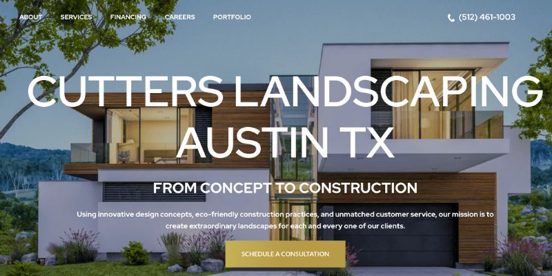
We love Cutters Landscaping’s website because it’s robust, responsive, and very well designed. As you may know, having clear, high-resolution images is a must for service-based businesses. Whether it’s landscaping, construction, or a beauty salon—customers expect to see quality photos of your work. The copy on their homepage is also friendly, clever, and does a good job of interweaving their company values.
We like this website because:
- It has a few hover-responsive buttons and sections to make the website feel interactive.
- It highlights their value propositions with smart copy and professionally shot images.
- It’s sophisticated but very user-friendly.
2. North West Landscaping
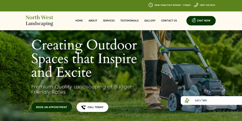
What we love about North West Landscaping’s website is the overall theme and functionality. The color scheme is traditional for a landscaping company, but the use of dark green, olive, and beige over bright colors gives their site a more polished look.
We like this website because:
- It has a cohesive theme and layout.
- Call-to-action buttons and a catchy phrase are placed above the fold.
- It provides a brief description of each service with clear photos of past work.
3. Augusta Lawn Care Services
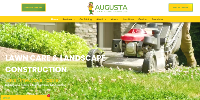
Augusta Lawn Care Services makes great use of professionally shot video and images for visitors to view the scope and quality of their services. All of their content is branded—whether it shows a company car, a landscaping technician, or their offices. Although using good stock images is a great alternative, going the extra mile of shooting their own content helps build brand recognition.
We like this website because:
- It’s bright, user-friendly, and on-brand.
- It has an extensive video gallery.
- Overall, the site looks professional and well-designed.
4. Dennis’ 7 Dees Landscaping
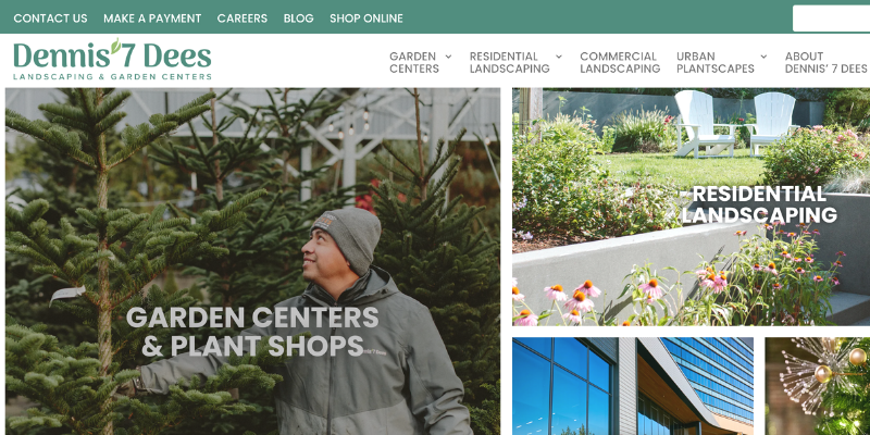
Another site that makes good use of imagery is Dennis’ 7 Dees Landscaping. Their website is inviting, easy to navigate, and has an overall modern look. When visiting the website, it’s clear that it’s often updated with seasonal content—which signals to both visitors and search engines that the company is active online.
We like this website because:
- Content on the home page is separated into visually digestible sections.
- The top bar has a “Make a Payment” button for quick access.
- It illustrates their company values, awards, and community impact.
5. Branch Out Landscapes
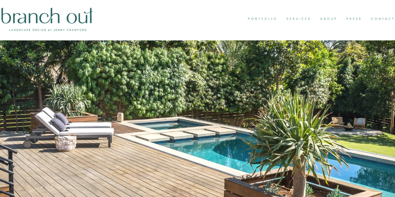
Branch Out Landscapes by Jenny Crawford put together a beautiful yet minimalist website that perfectly captures the company’s modern approach to landscaping. The bright and crisp images along with a clean, straight font make the website easy to peruse.
We like this website because:
- It’s simple and easy to navigate.
- It looks modern and clean.
- It provides base pricing and includes a brief description of their design process.
6. Hoffman Design Group
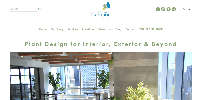
Another example of a modern approach to a landscaping website is Hoffman Design Group’s site. Their design is simple, bright, and clean which perfectly mirrors their past landscaping work. The photos appear quite large on the home page which helps draw the eye to their work and specialties.
We like this website because:
- It uses different font weights and styles in a way that’s balanced and appealing.
- It provides a “Resources” section with testimonials and post-pandemic solutions.
- It integrates their social media channels for a closer look at their work.
7. GMC Landscapes
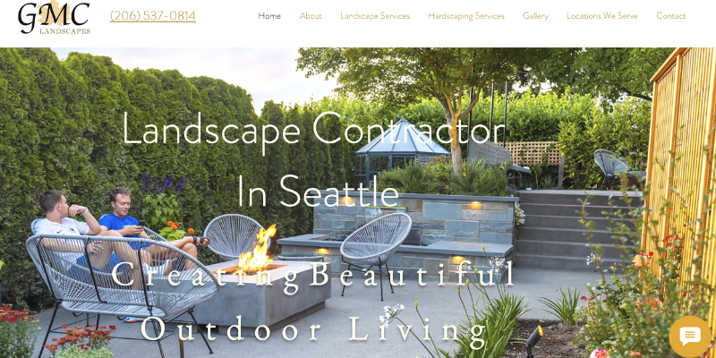
If you have a few quality customer testimonials, check out the way GMC Landscapes integrates their 5-star review on their home page. It’s very common to do this on any website, but seeing reviews appear directly from Google is a good way to add credibility to customer testimonials. We also enjoy how the home page is succinct with just a few beautiful images, links to their services, testimonials, and a contact form.
We like this website because:
- The color scheme is warm and appealing.
- The gallery is well laid out with crisp and bright images.
- Their license number is easy to spot on the home page which helps reassure potential customers.
8. Outdoor Makeover & Living Spaces
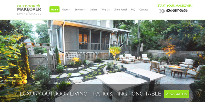
If you’re ready to add an interactive element to your landscaping website, check out Outdoor Makeover & Living Spaces for some inspiration. Their map with popups of the different types of services they can provide around a home is a fun way to get visitors to engage with your website.
We like this website because:
- The design is cohesive and offers a simple but engaging interactive element.
- It has multiple call-to-action buttons from “Learn More,” to “Schedule Consultation.”
- The copy on the page helps showcase their level of knowledge and expertise around landscaping.
9. Tulip Tree Landscaping
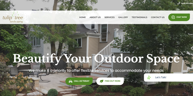
Nowadays, service-based businesses need more than just a pretty website. Websites need to offer features that allow customers to self-serve. To see this in action, check out Tulip Tree Landscaping’s website. From their site, customers can call, email, book, chat, and more with one click—reducing any heavy lighting for the Tulip Tree team and providing customers with a seamless experience.
We like this website because:
- It has a chatbot feature to answer questions directly from the site.
- Highlights plenty of before and after photos of their past work.
- Customer testimonials are prominently displayed on the home page.
10. Flores Artscape, Inc.
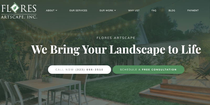
You just need a few essential website features to build a site that’s both functional and visually appealing. For an example, check out the Flores Artscape website. With clear call-to-action buttons, a few illustrated icons, and high-quality photos, their website is a great place for potential customers to check out their past work and services.
We like this website because:
- It includes an FAQ section.
- It has a dropdown menu with a detailed list of their services and example of past work.
- It has a “Why Us” page to encourage customers to book their services over the competition.
As a landscaper, most of your time is probably spent on job sites and not behind a computer managing your online presence. If you’re ready for an efficient website that helps automate processes like booking, payments, client communications, and reviews, check out GoSite websites today.
%20(1)%20(1).png?width=340&name=Group%2012%20(2)%20(1)%20(1).png)

