Enjoy a Google-friendly done-for-you website in days!
Only GoSite launches a complete, affordable online presence fast for local service pros.
10 Best Commercial Cleaning Websites
Discover our pick of best commercial cleaning websites and learn best practices for visual design. Get inspired and optimize your website today.

Commercial cleaners work hard every day to keep large spaces tidy and keep their customers happy. But they have to work just as hard to get the word out. Traditional advertising, like print and radio ads, aren’t as popular anymore. So many commercial cleaning businesses are turning to websites. So how can you get online?
With so many different companies vying for attention online, it’s difficult to decide which could be the best inspiration for your own website. To make your search easier, we have compiled a list of the top 10 commercial cleaning websites in 2023.
Jump To:
- House Cleaning Websites Vs Commercial Cleaning Websites
- What Makes a Great Commercial Cleaning Website
- Our Top 10 Commercial Cleaning Website Picks
- Conclusion
House Cleaning Websites Vs Commercial Cleaning Websites
Before we dive into the list, it’s important to understand the difference between house cleaning websites and commercial cleaning websites.
House cleaning sites are typically used to find a maid service or domestic cleaners who offer services for homes and apartments. These companies may specialize in specific areas unique to residential living spaces, but they’re not typically equipped to handle the demands of commercial businesses. This is because commercial spaces are usually much larger and require different cleaning techniques, including floor waxing, window washing, etc.
Commercial cleaning websites, on the other hand, are designed specifically to help business owners find reliable janitorial services. They also provide a variety of specialized services that meet the needs of corporate clients.
Because commercial cleaning appeals to business facilities management managers (rather than homeowners), your website should cater specifically to this audience. Commercial cleaning clients intend to invest a lot more money with a high demand for quality cleaning and disinfecting.
What Makes a Great Commercial Cleaning Website
Many factors go into making a website great. Here are five aspects of commercial cleaning websites that make them stand out to us.
Accurate Business Information
A great commercial cleaning website should give accurate information about the company, its services, and its staff. This includes:
- Contact information: Address, phone number, and email
- Services offered: Carpet cleaning, window washing, janitorial services, etc.
- Customer reviews and ratings: Positive feedback from customers
These three are the basics that every commercial cleaning website should have. Other information that makes your business stand out, like awards, should be included too. All of this information should be constantly updated and easy to find.
Easy to Navigate
A great website should be easy to navigate and use. It should have:
- Clear menu structure: This allows users to find what they need quickly and easily
- Organized sections: Each section should be clearly labeled and include relevant information
- Intuitive navigation: Links should be placed logically so that users can move around the website with ease
All of these things will help customers quickly find what they need on your site. They’re fairly simple for you to implement with a cleaning company website template.
How to Take Action is Clear
Cleaning website design should be focused on making it easy for customers to take action. Whether it’s…
- Signing up for an account
- Scheduling a service
- Requesting a quote
The steps involved should be easy to follow. The best websites for cleaning services allow you to do these things without leaving their page.
Solid First Impression (Look & Feel)
The first impression of a website is important. A great commercial cleaning website should have:
- Professional design: The visual elements such as colors, fonts, and images should be consistent and appropriate for the industry
- Clear branding: Your logo, tagline, and other visuals associated with your business should be easily recognizable
- Mobile friendly design: Customers should be able to access your site from any device they choose without issue
These cleaning website design characteristics can help make visitors feel comfortable when visiting your website. They also make your website more memorable.
Website Power Widgets
In addition to a clear and intuitive navigation structure, great commercial cleaning websites should also include website power widgets. These are interactive elements that can be used to provide additional information or offer services directly on the website. Examples of these widgets may include:
- Online scheduling buttons: Customers can book services directly from your website
- Quick payment links: Customers can make payments online easily
- Online chat: Website visitors can get in touch with you directly through your website
These features make it easier for customers to interact with your business without ever leaving the site. Cleaning services website templates are helpful to make this happen. But some services, like GoSite, will even help build the website for you.
Our Top 10 Commercial Cleaning Website Picks
1. Superior Janitorial Group - Superiorjangroup.com
Superior Janitorial Group is a GoSite Website Customer - Learn More!
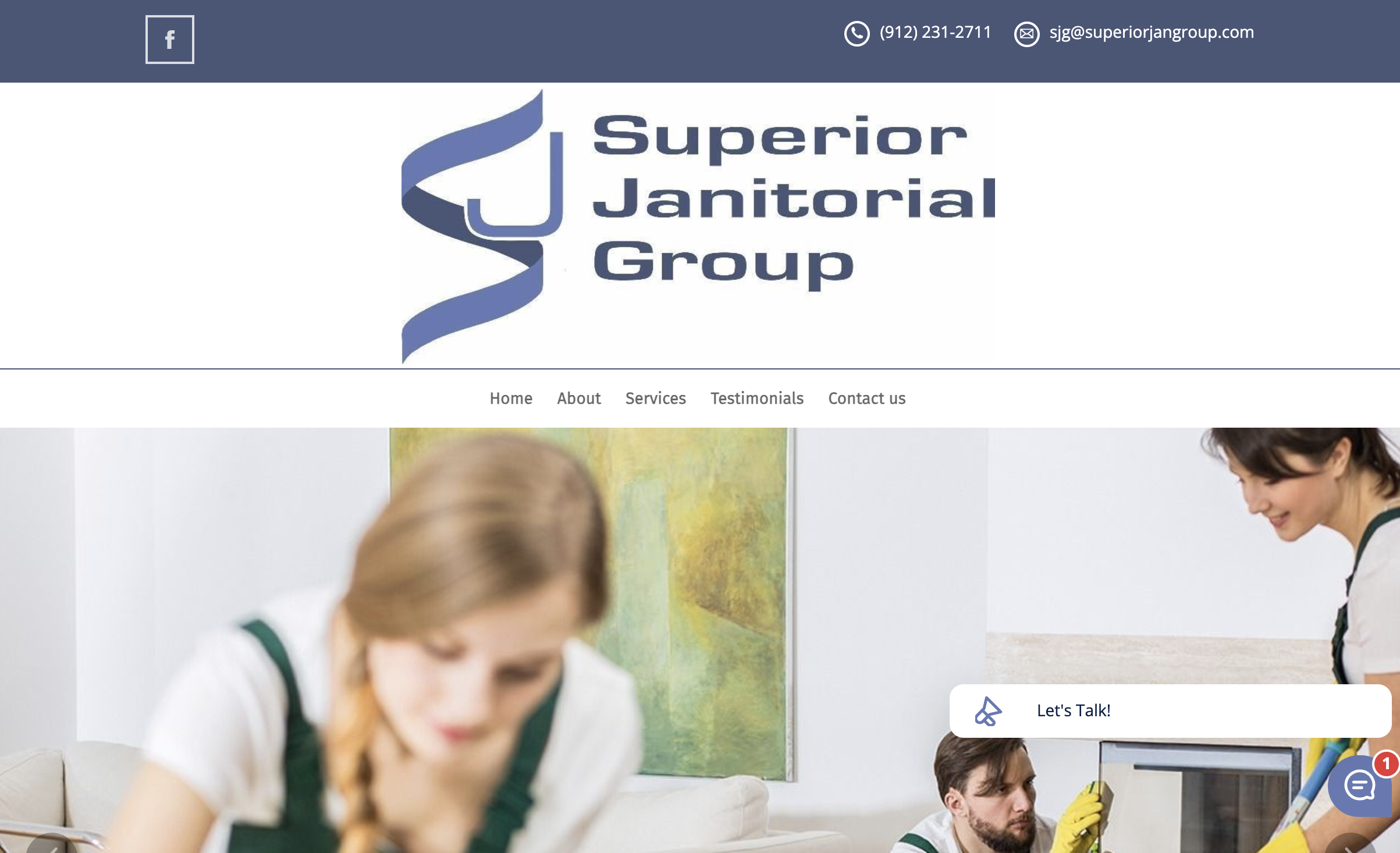
Superior Janitorial Group’s website has a notably clean design, as you can see above. The top header showcases their contact information. They also have even more ways to contact them at the bottom of the page. Plus, you can chat with them on the website, as you can see in the lower right-hand corner of the image. You can easily get the information you need from simply labeled tabs on a bar underneath their slick logo.
Superior Janitorial Group’s website isn’t just tailored to its customers. They also have a convenient QR code at the bottom of their page labeled, “Scan here for JOB APPLICATIONS”. This makes it easy for potential hires to apply for a job with them, which will give them a bigger pool of applicants to choose from.
2. Stratus - Stratusclean.com
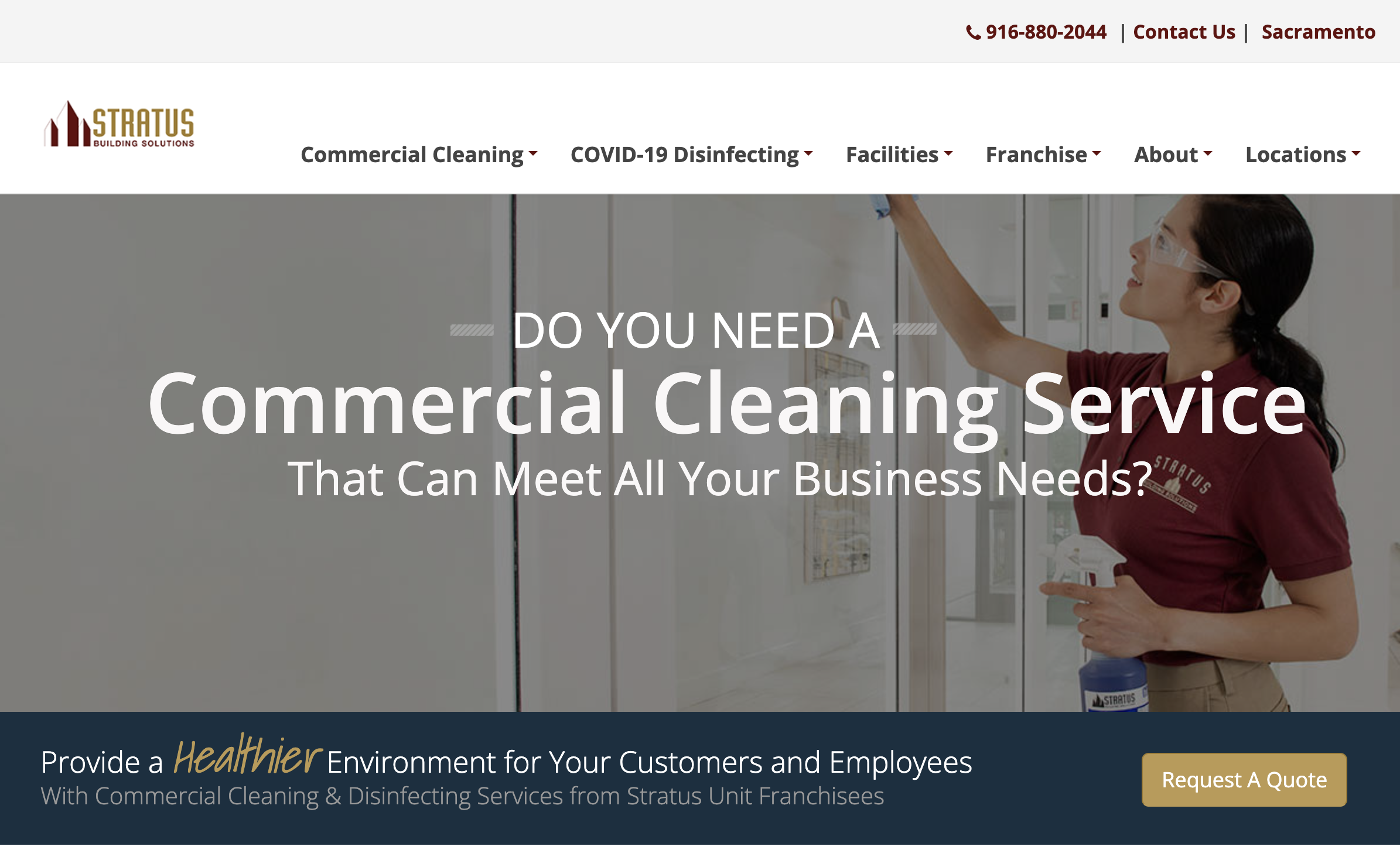
Stratus Building Solutions keeps visitors engaged with a rotating photo slideshow right at the top of their home page. They make it easy to contact them and request a quote through eye-catching gold action buttons. Stratus also makes it apparent that they have multiple locations. By clicking one of their multiple “Locations” tabs, you are directed to a new page. There, you can type in your zip code and find the location closest to you.
Stratus also keeps their information current. You can tell this because they have an entire tab on COVID-19 Disinfecting. They are staying up-to-date with what customers want from their cleaning services. By making this a priority, companies that have newly implemented COVID-19 protocols will probably choose them first.
3. Rachel and Eddy Cleaning Services - Rachelandeddycleaningservices.com
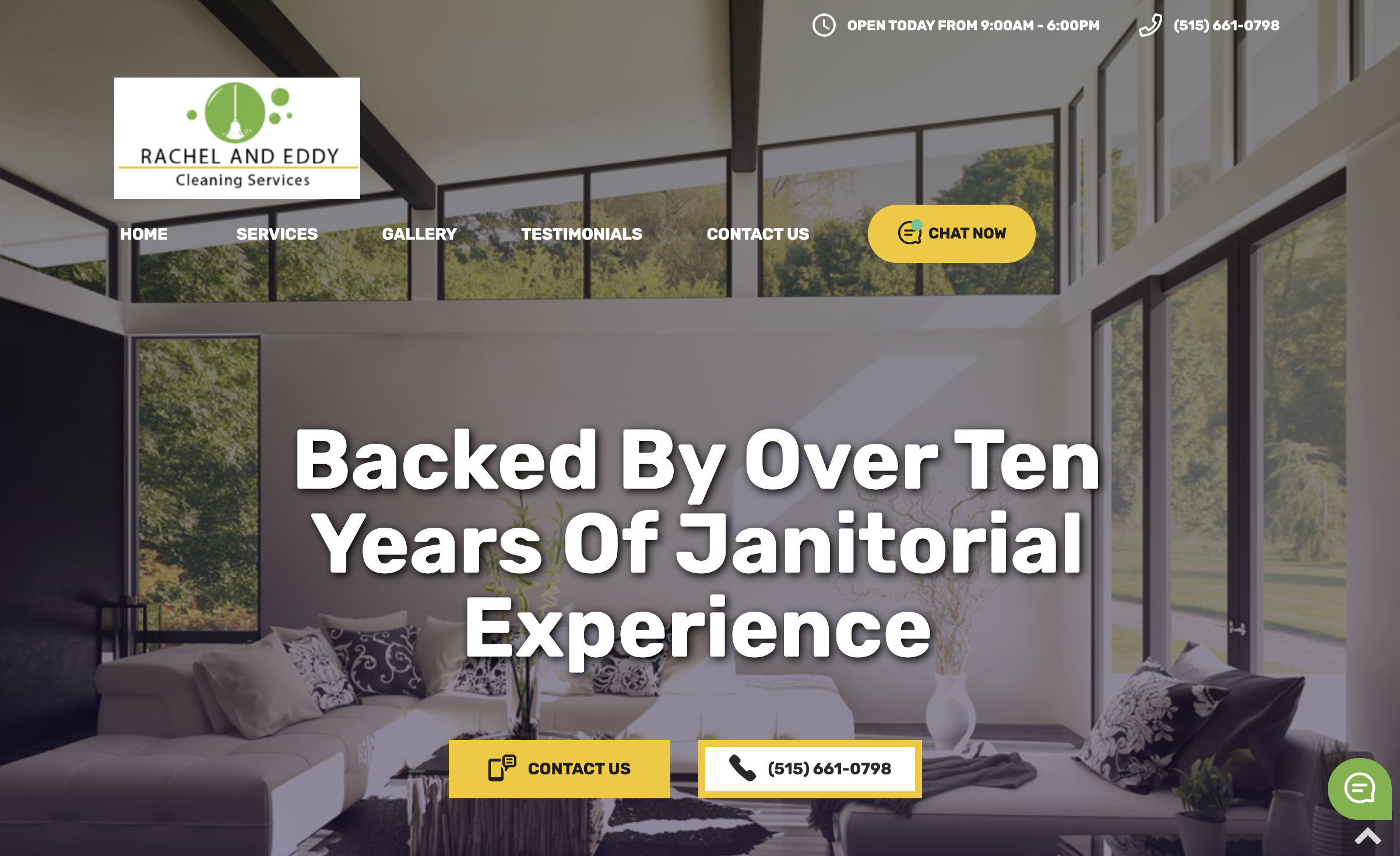
Rachel & Eddy Cleaning is a GoSite Website Customer - Learn More!
Rachel and Eddy Cleaning Services of Iowa grabs your attention with an image background right away. They also keep their tabs simple to prevent the website from getting too cluttered. With five options to get in touch with the business, they make it easy for customers to get in touch in the way that is most convenient for them. They also list their hours for the current day at the top of the page, which updates automatically.
Rachel and Eddy Cleaning Services let their customers know they are in good hands by listing the awards they have won for their services. HomeAdvisor, Angie’s List, and the Better Business Bureau have all ranked them among the best. By putting images of these awards on their homepage, new customers are more likely to give them a try.
4. Anago Cleaning Systems - Anagocleaning.com
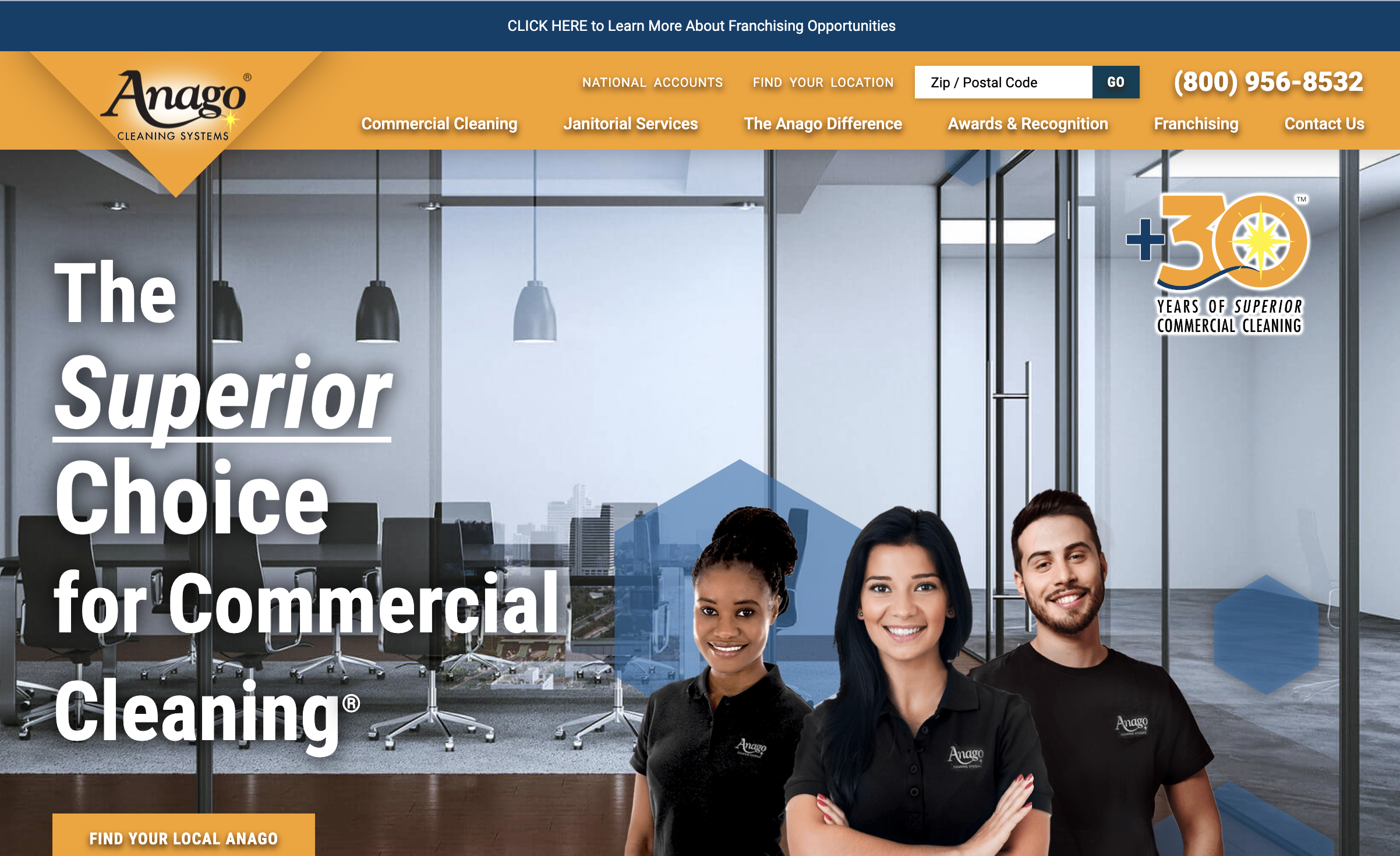
National chain Anago Cleaning Systems is a great example for big companies with multiple locations. They have multiple tabs for finding your “local Anago”, as well as tabs to check out franchising and national accounts. They highlight the fact that they have over thirty years of experience and received awards and recognition. Plus, they differentiate between commercial cleaning and janitorial services so customers can easily find what they need.
Anago’s cleaning services website is seamless because they use a hexagon image throughout their site. You can see this in the image above. Hexagons are also used as tabs throughout their homepage and as ways to showcase information. This is called consistent branding. By doing this, Anago makes its page cohesive, clean, and memorable.
5. G.Co Commercial Cleaning - Gcocommercialcleaning.com
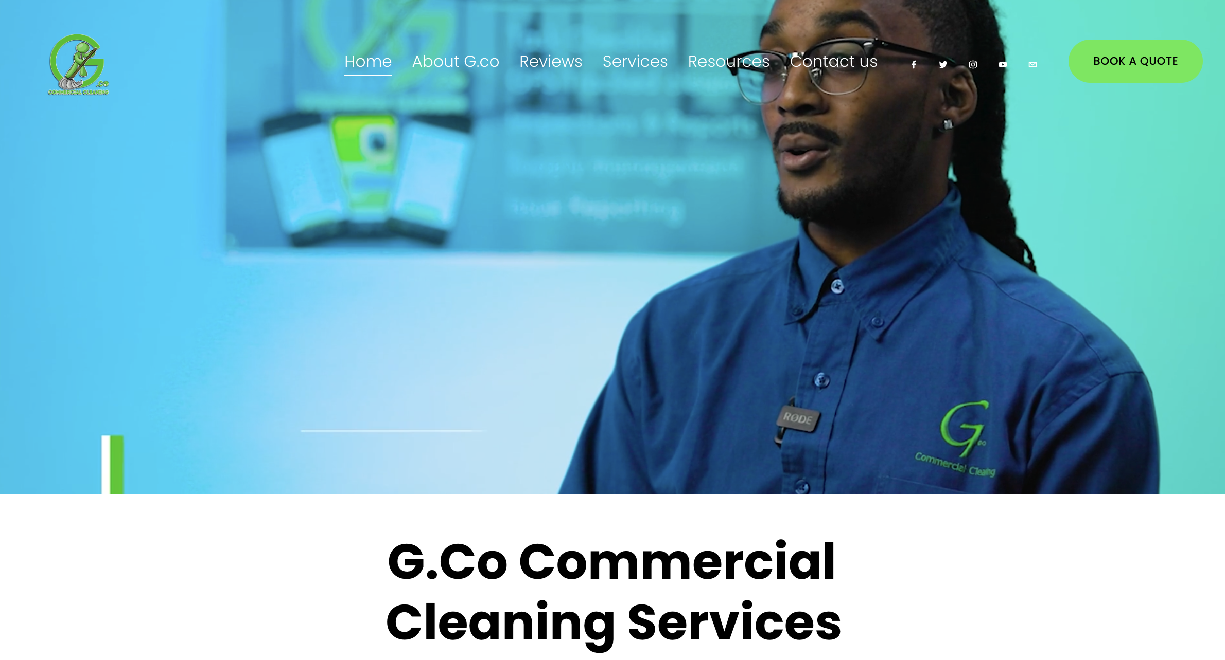
Washington-based G.Co Commercial Cleaning Services captures your attention with a video at the top of their page and throughout. They allow you to see their cleaners at work and form a personal connection with them. G.Co also uses the color green and its logo throughout the site, videos, and picture slideshow. This makes them look more professional and helps you remember their logo and name.
G.Co also makes it incredibly easy to book an estimate or appointment. You can see what times they have available on nearby dates, then simply insert your information. Because scheduling with them is easier and less time-consuming than other brands, customers are more likely to give them a try.
6. Vanguard Cleaning Systems - Vanguardcleaning.com
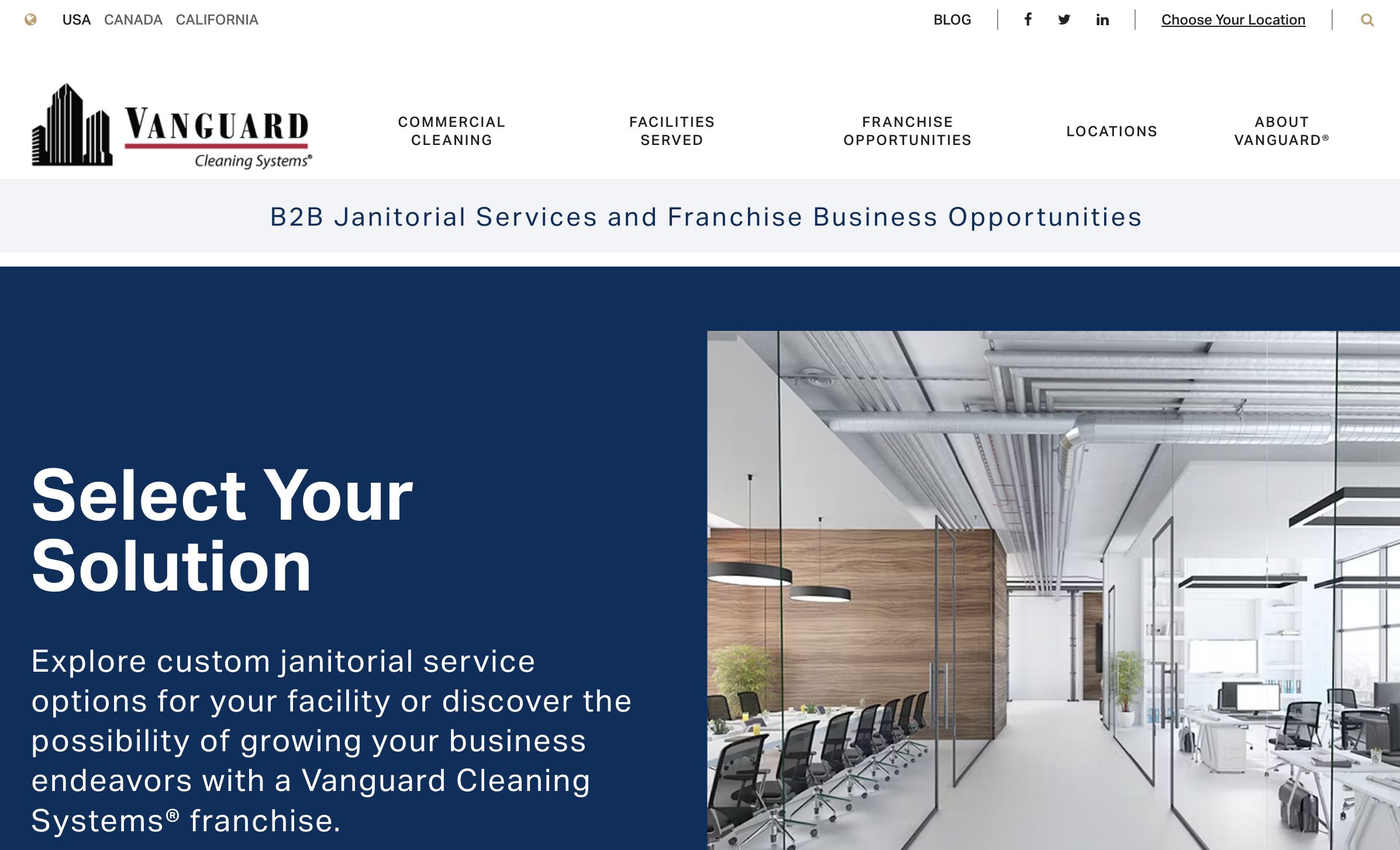
Vanguard Cleaning Systems has locations all around North America, which you can find through one of a few search options at the top. They also link to their Facebook, Twitter/X, and LinkedIn accounts. These accounts allow customers to learn about your commercial cleaning company in a more personal way. You can also increase your pool of customers because they are more likely to be on social media than on your website.
Vanguard is also one of many websites to make use of a blog. Blogs are a great addition to your website because they allow customers to connect with you and bring in more traffic. By including the right keywords, someone searching “how to clean office chairs” will find that your company is the best solution.
7. CC Cleaning Service - Cccleaningnv.com
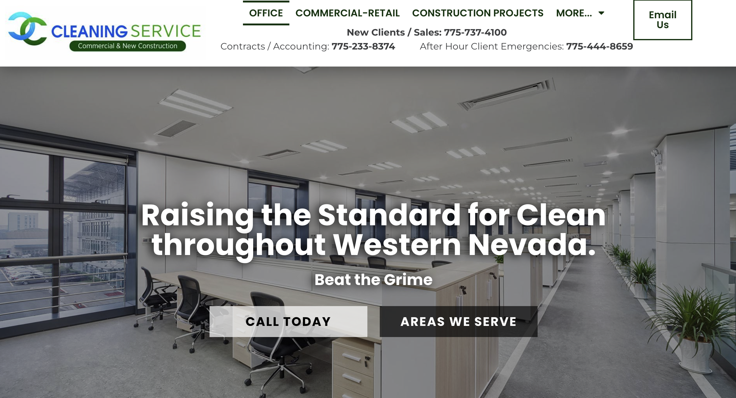
CC Cleaning Service of Western Nevada highlights that they offer office, commercial, and retail cleanings, as well as new construction projects. They also differentiate ways to contact them. This helps them address specific customer concerns. It also makes customers feel like their concerns will be handled well because a specialist is on the line with them.
CC makes excellent use of services from Google. At the bottom of their page, they integrated a Google Map of their location. This allows customers to get directions to their location from within the website. They also feature reviews written on Google Maps. These reassure potential customers that CC’s services are top-notch.
8. Service Master Clean - Servicemasterclean.com
Service Master Clean’s yellow and teal logo colors carry through the entirety of their website, from photos of trusted cleaning team to internal links. This makes their website clean, organized, and inviting. Service Master also uses a chat function, as you can see in the bottom right-hand corner. They emphasize human connection by showing a picture of exactly who the website user will be chatting with. This brings in users who may be sick of dealing with bots.
Service Master also makes sure to highlight that they have “certified cleaners”. This is because they are an Association for the Healthcare Environment (AHE) Corporate Champion and an Indoor Environmental Healthcare and Hospitality Association (IEHA) Member. New customers are more likely to trust them because they show that they have these credentials.
9. CNS Cleaning Company - Cnscleaningco.com
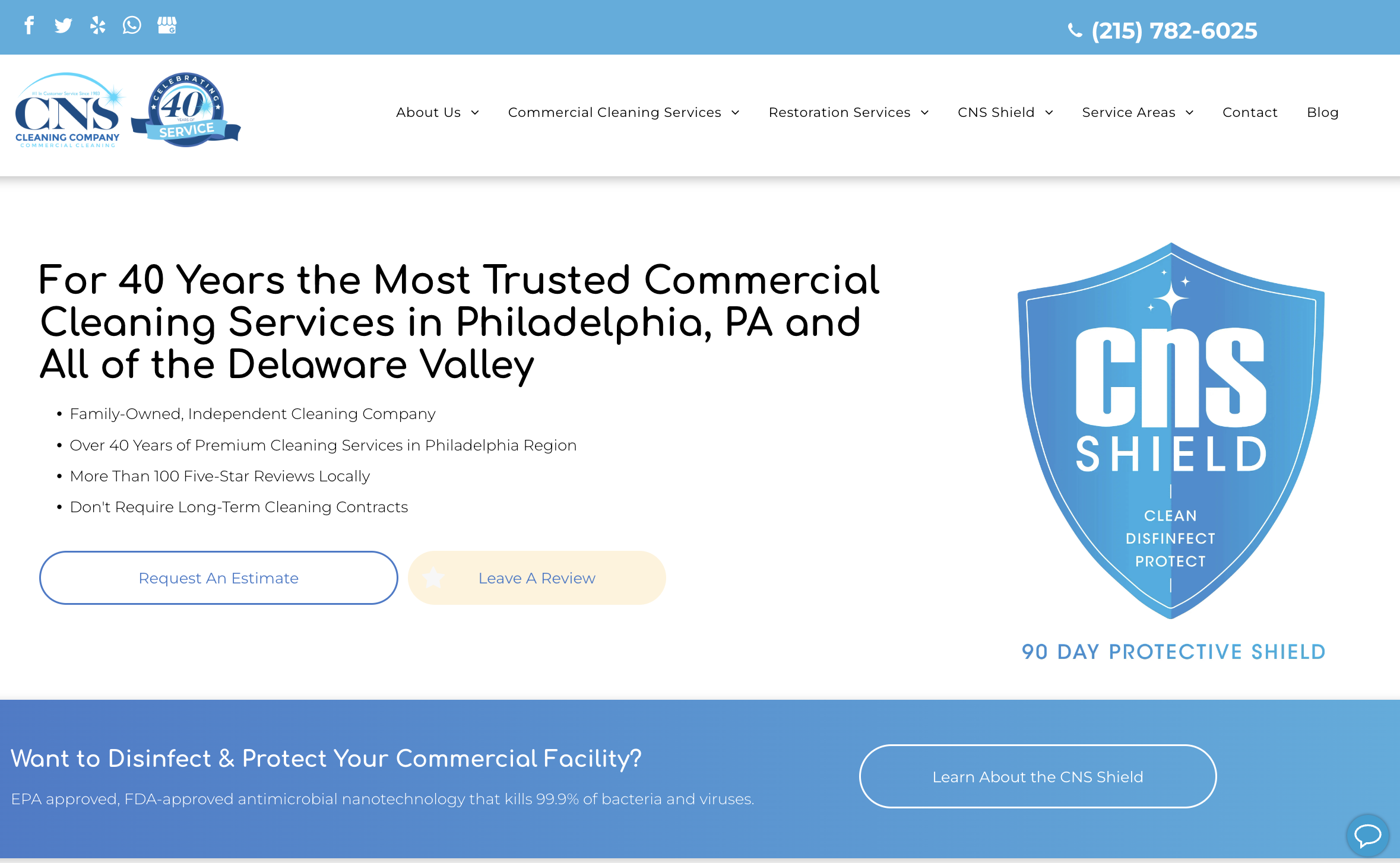
CNS Cleaning Company of the Delaware Valley showcases standard information, like contact details, while also calling attention to things that make them unique. One of these, as you can see in the image, is their CNS Shield cleaning process. This is an “FDA-approved antimicrobial nanotechnology that kills 99.9% of bacteria and viruses”. Right off the bat, they are setting themselves apart from the competition.
Also, CNS recognizes how powerful reviews can be for businesses. That’s why they have a “Leave A Review” button embedded front and center on their site. Clicking this directs you to Google reviews, where you can write your thoughts with a star rating.
10. Jani King - Janiking.com
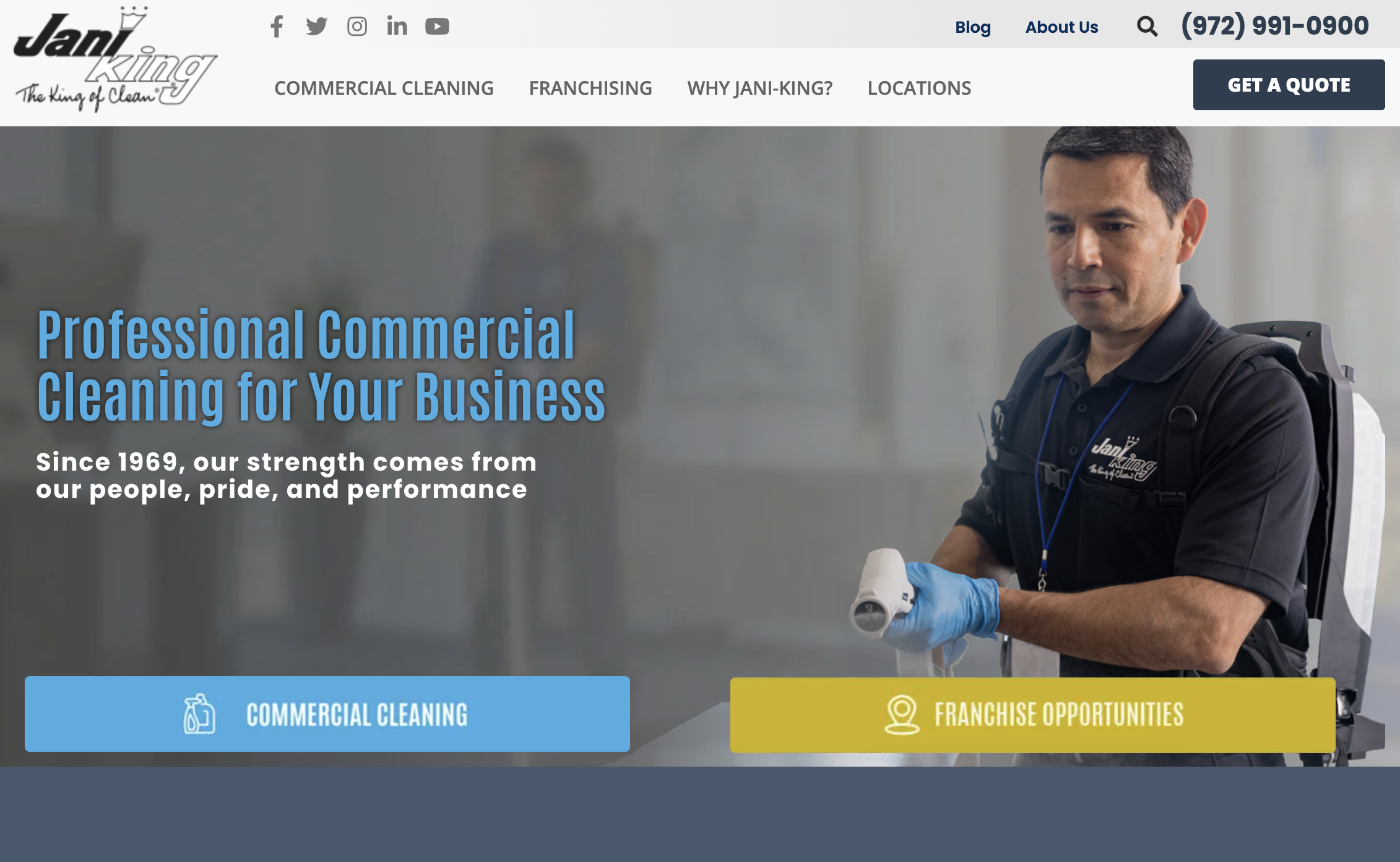
Jani-King is an international chain that has been in operation since 1969. These facts give the impression that the company has staying power and can be trusted. Jani-King takes advantage of this and emphasizes them throughout the page. They list recognizable partnerships and clients. They also highlight that they have 50 years of experience and over 6,600 franchises across 10 countries around the world.
Jani-King makes it easy to invest in their business by requesting a cleaning or franchising. They have tabs at the top of the page that carry throughout to keep directing customers in either of these two directions.
Create an Impactful Website To Drive Business Success
A great commercial cleaning website can be a powerful tool for driving business success.
It should provide accurate and up-to-date information about the company, its services, and its staff. It should also be easy to navigate with clear menu structures, organized sections, and intuitive navigation links. Lastly, power widgets can help to streamline customer service and create a more interactive experience on the website.
By following these tips and utilizing what you've learned from the examples, you can ensure that your commercial cleaning website will stand out from the competition!
%20(1)%20(1).png?width=340&name=Group%2012%20(2)%20(1)%20(1).png)

