Enjoy a Google-friendly done-for-you website in days!
Only GoSite launches a complete, affordable online presence fast for local service pros.
Our 10 Best Picks for Junk Removal Websites
Get inspired by our selection of the best junk removal websites while uncovering key insights into visual design and marketing best practices.

Are you a junk removal business owner looking to establish a strong online presence?
Nowadays, having a professional website is essential for attracting customers and growing your business. This list of stellar junk removal websites will give you ideas and inspiration to build or improve your own site. So let's get started.
What Should Junk Removal Websites Look Like?
When junk removal customers search online for service providers, they have specific expectations for business's website before they make a call. These expectations are primarily influenced by their need for convenience, reliability, and a seamless user experience (IOW, they enjoy being on your website).
Here are some key aspects that customers typically expect.
Clear, Accurate Business & Contact Information
Customers expect to find clear and concise information about the services you offer. This includes details about the types of junk that can be removed, availability, and any additional services provided. Providing transparent and comprehensive information helps customers make informed decisions.
Example: A junk removal business website may include a dedicated "Services" page that lists the various types of junk they remove, such as furniture, appliances, construction debris, etc., along with any restrictions or limitations.
Easy Online Booking & Contact Options
Customers prefer websites that offer hassle-free online booking or contact options. They want to quickly schedule a pickup or request more information without the need for excessive phone calls or emails. Providing a user-friendly interface and clear instructions for booking or contacting the business enhances the customer experience.
Example: The website might include a prominent "Book Now" button that leads customers to a simple form where they can provide their details, select a preferred date and time, and specify the type of junk to be removed.
Testimonials & Reviews
Customers seek reassurance and trust in the junk removal service they choose. Including testimonials or reviews from satisfied customers on the website helps build credibility and showcases the business's track record of delivering quality service. Positive feedback and ratings can greatly influence a customer's decision-making process.
Example: A dedicated "Testimonials" or "Reviews" section on the website can feature quotes or reviews from previous customers, along with their names and locations to add authenticity.
Pricing Transparency
This part can be tricky because it's not always in your best interest to give out full and detailed pricing. This is especially true if you customize pricing based on the type or amount of junk removal required.
Still, transparency in pricing is crucial for customers evaluating different junk removal services. Customers expect to find basic pricing information on the website, such as tiers based on the volume or weight of the junk, any additional fees, and any discounts or promotions available.
If you have the money to invest in engagement tools, providing a pricing page or an easy-to-use quote calculator helps customers understand the cost involved upfront. Be sure to include disclaimers to protect you from underpricing jobs that will cost you more to complete (such as handling toxic waste).
Example: The website might have a "Pricing" page that provides a breakdown of pricing based on different junk removal categories, with additional details on any extra charges such as disposal fees or distance-based fees.
Visual Content Showing Your Services in Action
Engaging visual content, such as high-quality images or videos, helps customers visualize the service and understand what to expect. Showcasing before and after photos or videos of completed jobs can demonstrate the effectiveness of the junk removal service and its attention to detail.
Example: The website might include a gallery or portfolio section that displays visually appealing images or videos of junk removal projects, highlighting the difference made by the service.
By addressing these expectations on their websites, junk removal businesses can effectively attract and convert online customers, ultimately establishing their credibility and gaining a competitive edge in the market.
The 10 Best Junk Removal Websites to Get Ideas From
1. Rubbish Rebels - Rubbishrebels.com
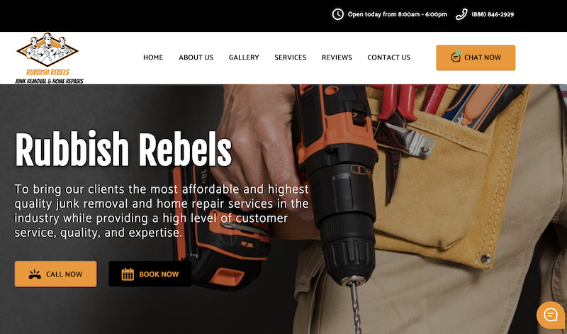 Rubbish Rebels is a GoSite Customer - Learn More About GoSite Sites
There are several things that make this website a standout, and here are a few reasons why we like it.
The website is well-organized and visually appealing, making it easy for users to navigate and understand. It uses high-quality images and videos to effectively convey its message.
There are buttons placed strategically throughout the site to prompt users to take action. The website is also optimized for mobile devices, ensuring a smooth browsing experience on smartphones and tablets.
Testimonials, reviews, and case studies are included to build trust and credibility. One example of a well-designed page is the "About Us" section, which tells a compelling story and showcases the company's initiatives.
Overall, Rubbish Rebels did a great job with its user-friendly design, engaging content, strategic call-to-action placement, mobile-friendliness, and social proof.
2. 1-800-Got-Junk? - 1800gotjunk.com
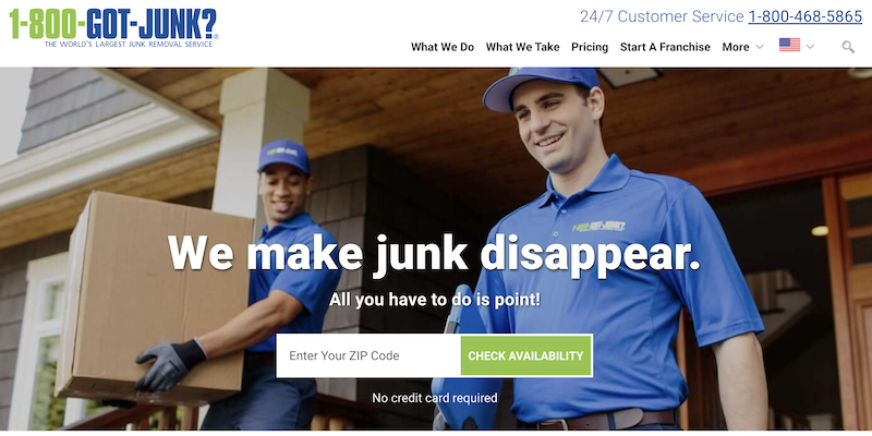
One of the main strengths of this website is its clean and modern design. The layout is visually appealing and easy to navigate, ensuring a seamless user experience.
The website's homepage immediately grabs the visitor's attention with a compelling hero image and a clear call-to-action. The use of high-quality visuals and concise messaging helps to convey the main value proposition of the company - hassle-free junk removal service.
Another notable aspect is the website's well-organized and informative content. The site provides detailed information about the services offered, including pricing, FAQs, and customer testimonials. This helps build trust and credibility with potential customers and encourages them to take the next step in the conversion process.
Furthermore, the website is optimized for mobile devices, ensuring a seamless browsing experience across different screen sizes. This mobile responsiveness is essential in today's mobile-first world, as more and more users access websites through their smartphones and tablets.
Lastly, the website integrates a user-friendly booking system, allowing visitors to easily schedule junk removal services online. This convenience enhances the overall user experience and streamlines the conversion process, ultimately driving more leads and customers.
In conclusion, 1-800-Got-Junk excels in various areas, including its visually appealing design, informative content, effective SEO strategies, mobile responsiveness, and user-friendly booking system. These elements work together to create a compelling online presence that not only attracts visitors but also converts them into loyal customers.
3. Gerard's Hauling & Demo - Gerardshaulinganddemo.com
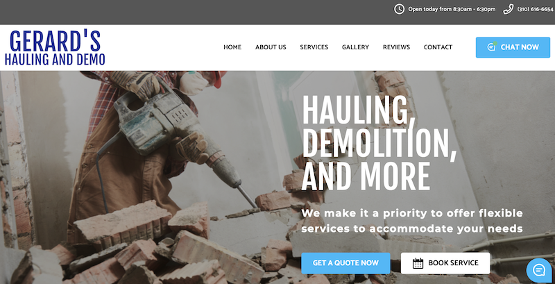 Gerard's Hauling & Demo is a GoSite Customer - Learn More About GoSite Sites
Gerard's Hauling and Demo effectively conveys its services through clear and concise messaging on its website. The messaging is succinct, ensuring that visitors can easily comprehend the company's main offerings and advantages. This clarity is crucial for potential customers to promptly understand the value the business can provide.
The website strategically integrates compelling calls-to-action (CTAs) that encourage visitors to perform specific actions, such as arranging a consultation or soliciting a quote. By directing users towards desired conversion actions, the website enhances the likelihood of generating leads and conversions.
Testimonials and case studies on the website add credibility and trustworthiness. By showcasing positive feedback from satisfied customers and highlighting successful projects, potential clients can gain confidence in the company's abilities and trust their services.
The website is mobile-responsive, ensuring an optimal viewing experience across various devices. This feature is crucial for capturing and engaging a wider audience. The website adjusts seamlessly to different screen sizes, maintaining its functionality and visual appeal.
Contact information, including phone number and email address, is prominently displayed on every page of the website. This makes it convenient for potential customers to get in touch and increases the likelihood of inquiries and conversions.
The inclusion of a "Before and After" gallery showcasing completed projects allows visitors to see the quality of work Gerard's Hauling and Demo provides and the transformation they can achieve. This feature can be particularly compelling for potential customers seeking evidence of the company's skills and expertise.
4. College HUNKS - Collegehunkshaulingjunk.com
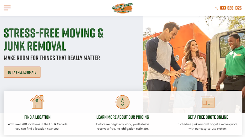
The College Hunks' website stands out and is effective due to its appealing aspects. First and foremost, it has a clean, intuitive, and easy-to-navigate layout
All critical information about its services is clearly laid out on the homepage, along with prominent call-to-action buttons for requesting a quote or scheduling a service.
This site looks great on mobile devices, too, and on every page, you get detailed information about services, pricing, and process.
Like everyone on our list here, they've included engaging content like customer reviews, testimonials, and before-and-after pictures. College Hunks was also smart to offer localized searches to highlight availability in specific areas.
5. LA Best Hauling & Junk Removal - Labesthaulingandjunkremoval.com
 LA Best Hauling & Junk Removal is a GoSite Customer - Learn More About GoSite Sites
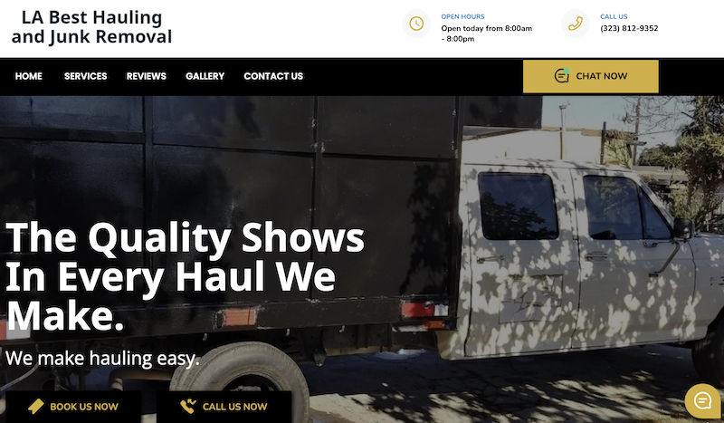
LA Best Hauling and Junk Removal offers a range of services for both residential and commercial clients. They specialize in junk removal, furniture removal, and property cleanouts. The website uses high-quality visuals and before/after pictures to demonstrate its capabilities.
The website stands out because it includes trust signals that build credibility. Customer testimonials and certifications show that the company is professional and experienced. These signals reassure potential customers that they can trust LA Best Hauling and Junk Removal to provide high-quality service.
The website is also mobile-friendly, so visitors can easily access and navigate it from any device. The user-friendly interface and clear messaging make it easy for visitors to understand the services offered and how to proceed.
Strategic call-to-actions (CTAs) are placed throughout the website to encourage visitors to take the next step, such as scheduling an appointment or requesting a quote. These CTAs are persuasive and help increase conversion rates.
Overall, the website excels in user-friendliness, clear messaging, visuals, trust signals, mobile-friendliness, and persuasive CTAs. These elements work together to create a seamless and engaging user experience. LA Best Hauling and Junk Removal has successfully showcased its expertise and professionalism in the junk removal industry.
6. Junk King - Junk-king.com
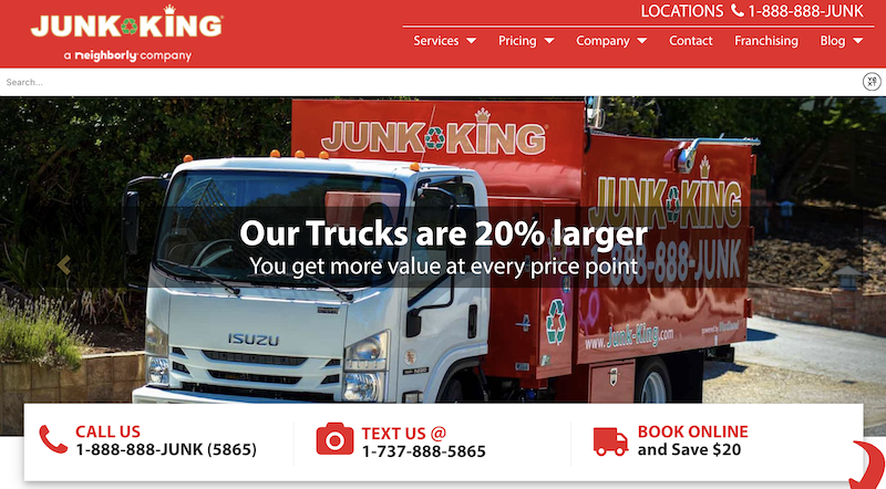
The website has a clean and easy-to-use design. The layout is well-organized, with a clear menu that helps visitors find information easily. The use of white space and clear text makes it easy for users to interact with the site.
The website looks good. It has high-quality pictures and videos that make it visually interesting for visitors. These pictures show the services offered by Junk King, like junk removal, recycling, and dumpster rental, so potential customers know what to expect.
The website's content is informative and well-written. It gives enough information to answer visitors' questions without being too long. The content is also optimized for search engines, so it can rank higher in search results.
Another good thing about the website is its clear call-to-action. Each page has buttons that encourage visitors to take action, like scheduling a pickup or asking for a quote. This makes it easy for potential customers to become leads or make a purchase directly from the website.
Also, the website works well on mobile devices. It looks good on different screen sizes and works well on desktop computers, tablets, and smartphones.
Overall, this website is user-friendly, visually appealing, informative, has a clear call-to-action, and works well on mobile devices. These things make it easier for potential customers to engage with the brand and become paying customers.
7. K & M Hauling & Junk Removal - Kmjunkhaul.com
 K & M Hauling & Junk Removal is a GoSite Customer - Learn More About GoSite Sites
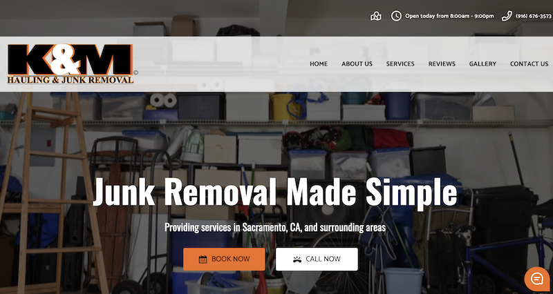
The website helps users convert by using clear and simple language. Users can easily take action, like scheduling a junk removal service or requesting a free estimate.
The website works well on different screen sizes, so it's easy to use on desktop, tablet, and mobile devices. This is important because so many people use their phones.
The website has clear and well-organized information about KM Junk Haul's services. Visitors can easily understand the details about what the company does, where they work, and how much they charge. This helps people make good decisions when it comes to hiring the right provider.
The website also has testimonials and reviews from happy customers. This shows that the company is trustworthy and makes people feel confident about using their services.
The website seems to be designed to show up in search results when people look for junk removal services in specific areas. This helps more people find the website and learn about the company.
One thing that stands out on the website is the big "Book Now" and "Call Now" buttons on the homepage. When people click on it, they can easily fill out a form to schedule a junk removal service or dial the business.
All of these things together give KM Junk Haul a great online first impression.
8. The Junkluggers - Junkluggers.com
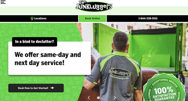
The Junkluggers' website is designed in a user-friendly way and uses persuasive content to highlight the benefits of choosing them over other competitors.
Testimonials and case studies are included to build trust and credibility by showcasing the positive experiences of previous customers. The website is also fully responsive, adapting seamlessly to different devices. This enhances the user experience and improves search engine rankings.
The strategic placement of call-to-action buttons, particularly the standout "Book Now" button on the homepage, encourages visitors to take action and book the company's services.
Overall, The Junkluggers' website excels in user-friendly design, persuasive content, responsiveness, and strategic use of call-to-action buttons, effectively communicating its unique selling proposition.
9. Guider Hauling - Guiderhauling.com
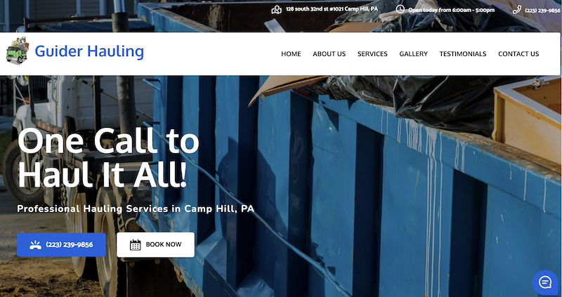 Guider Hauling is a GoSite Customer - Learn More About GoSite Sites
This website is fully responsive, meaning it looks and works well on both desktop and mobile devices. This ensures a smooth experience for users, no matter what device they use.
The website has a professional and trustworthy image. The branding elements, like the logo, colors, and fonts, are consistent and well-chosen. This helps build credibility and establish a strong brand presence. The website uses high-quality images and videos to make it visually appealing and grab visitors' attention. These visuals are strategically placed to improve the overall user experience and highlight the services offered by Guider Hauling.
On guiderhauling.com, the call-to-action buttons are visible and well-placed. They prompt users to request a quote, contact the company, or learn more about their services. This encourages user engagement and increases the chances of conversions.
The website provides detailed information about the company's services, pricing, and locations served. This helps users make informed decisions and removes any guesswork.
Additionally, the content is easy to read, well-written, and free from technical terms, making it accessible to a wide audience.
Including testimonials and reviews on the website serves as proof of Guider Hauling's expertise and reliability. Positive feedback from satisfied customers can help build trust and make potential customers more likely to choose their services.
Overall, this website is excellent because of its user-friendly design, mobile responsiveness, professional branding, engaging visuals, clear call-to-action, informative content, and testimonials. These elements work together to create a positive user experience and drive conversions.
10. JDog - jdogjunkremoval.com
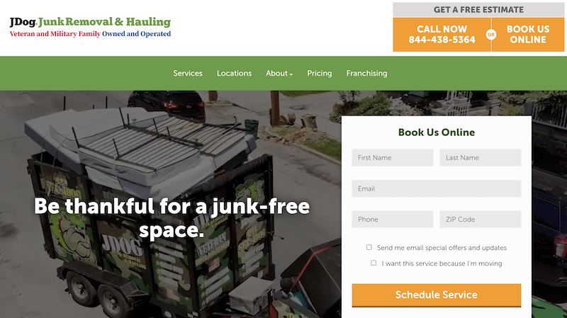
The website of JDog Junk Removal is designed with a focus on professionalism and reliability, utilizing its logo and color scheme to convey these qualities.
The use of call-to-action buttons and links throughout the website makes it easy for users to request a quote or schedule a junk removal service, enhancing the overall user experience. Additionally, the inclusion of testimonials from satisfied customers serves to establish credibility and trust, further solidifying JDog Junk Removal's reputation as a reliable and trustworthy service provider.
One of the key strengths of the website is its responsiveness and optimization for search engines. This means that regardless of the device being used, whether it's a desktop computer, tablet, or smartphone, the website will adapt and display properly, ensuring a seamless browsing experience for all users.
Furthermore, the website's search engine optimization (SEO) efforts ensure that it ranks well in search engine results, making it easier for potential customers to find JDog Junk Removal when searching for junk removal services online.
The website's design and layout are carefully crafted to not only look visually appealing but also to enhance functionality and ease of use. The clean and organized design allows users to navigate the site effortlessly, finding the information they need quickly and efficiently. The use of clear headings, subheadings, and bullet points further aids in the readability and comprehension of the content.
With its user-friendly design and optimized functionality, the website serves as a powerful tool for JDog Junk Removal to attract and retain customers in their industry.
Build a Junk Removal Website That Drives Business
We hope you gleaned a lot from our favorite junk removal websites. Like a broken record, you probably get the gist that having a site that is clean, easy to navigate with clear options to get in contact with your business are a critical foundation.
Adding fancy bells and whistles can greatly delight people who visit your site. But as you add more widgets, code, and features, make sure that the foundation remains in place. Whether you're building a website by yourself or hiring someone to do it for you, keep the these takeaways as the standard, and you will excel in your area.
%20(1)%20(1).png?width=340&name=Group%2012%20(2)%20(1)%20(1).png)

